Armature Systems
Repositioning a cybersecurity firm through advocating design thinking
Rebrand
Web Design
Design Guide
Corporate Identity
Scalable Design Systems
Internal Brand Adoption Strategy

Contents
Brand Consistency That Scales
Brand Consistency That Scales
By aligning stakeholders on shared design principles, the brand guide became a single source of truth—helping every team create faster and stay consistent across all platforms.
By aligning stakeholders on shared design principles, the brand guide became a single source of truth—helping every team create faster and stay consistent across all platforms.


Website Re-Design
Website Re-Design
(Coming Soon)
I transformed Armature’s digital presence into a streamlined, intuitive experience that communicates clarity, trust, and innovation.
I transformed Armature’s digital presence into a streamlined, intuitive experience that communicates clarity, trust, and innovation.

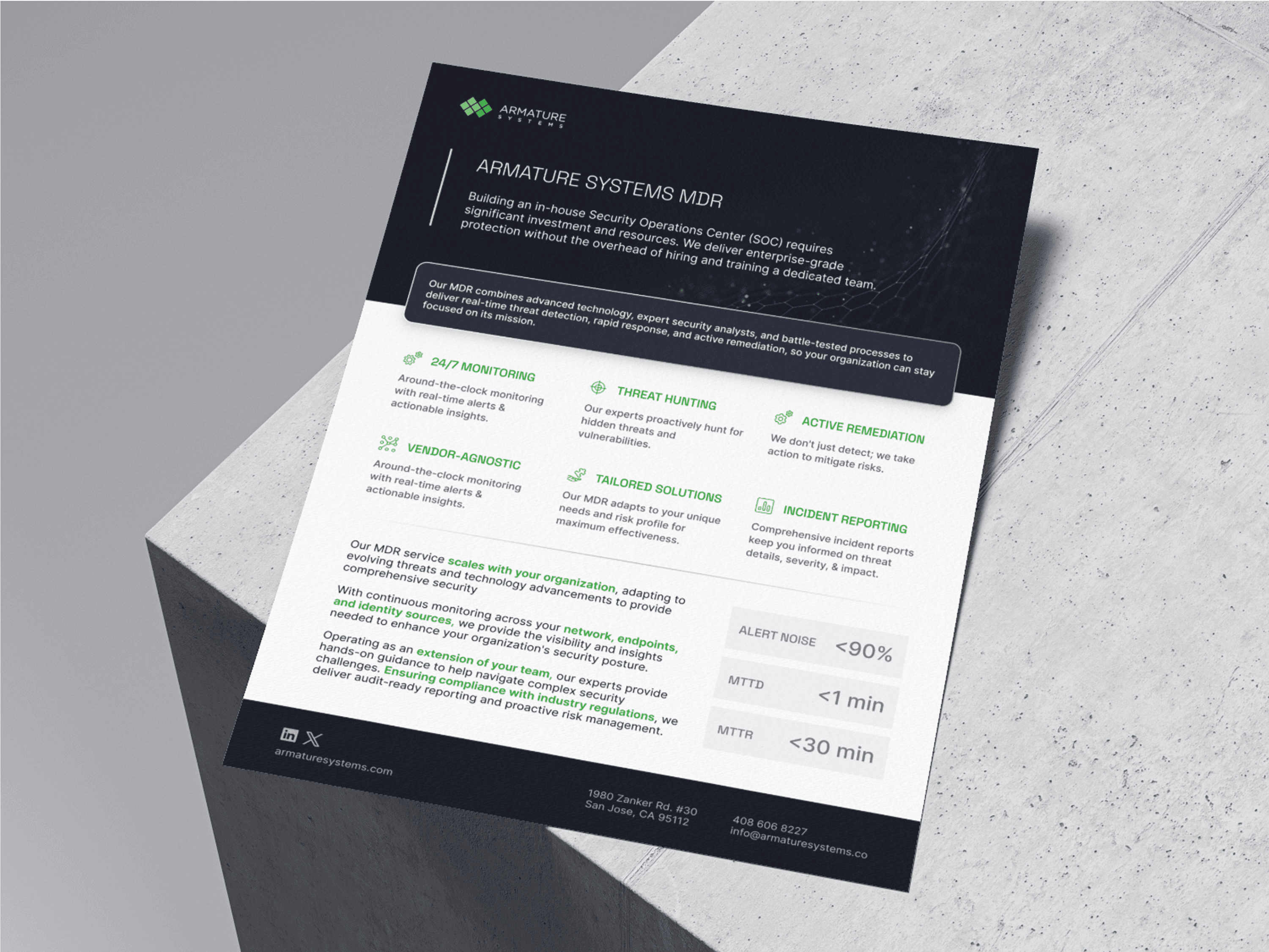

As the sole designer on this brand refresh, I led the creation of a cohesive visual system for Armature Systems—one that reflects the company’s technical depth and clarity of purpose. Collaborating closely with engineering, marketing, and product teams, I developed a system flexible enough for day-to-day use, yet grounded in a clear design logic that elevates the brand’s perception and usability.
As the sole designer on this brand refresh, I led the creation of a cohesive visual system for Armature Systems—one that reflects the company’s technical depth and clarity of purpose.
Not just an outdated identity, but a fragmented experience.
Armature’s existing brand identity, while established, had not evolved to meet the needs of modern, web-based platforms or digital marketing materials. Internal teams were improvising visual assets—often using colors that weren’t optimized for UI and relying on outdated typography like Playfair, which clashed with the brand’s technical tone. The system lacked cohesion across touchpoints, resulting in fragmented communication and a diluted identity.

To move the redesign forward, I led both an individual audit and a collaborative discovery process with the team. I reviewed brand guidelines, slide decks, and the current website to identify misalignments in tone, color use, and typographic hierarchy.


Facilitating strategic alignment.
In auditing these inconsistencies and collaborating across teams, I realized the challenge wasn’t just to redesign—it was to realign. The disconnect wasn’t just visual; it reflected a deeper uncertainty about how we were showing up as a company. So I set out to define who we are and who we’re not—what’s at the core of Armature Systems?

Not just an outdated identity, but a fragmented experience.
Armature’s existing brand identity, while established, had not evolved to meet the needs of modern, web-based platforms or digital marketing materials. Internal teams were improvising visual assets, resulting in inefficient workflows and a fragmented user experience.
To move the redesign forward, I led both an individual audit and a collaborative discovery process with the team.
Facilitating strategic alignment.
In auditing these inconsistencies and collaborating across teams, I realized the challenge wasn’t just to redesign—it was to realign. The disconnect wasn’t just visual; it reflected a deeper uncertainty about how we were showing up as a company. So I set out to define who we are and who we’re not—what’s at the core of Armature Systems?
Cross-collaboration for purposeful design.
Building on those insights, I curated a visual moodboard referencing both competitor brands and partner companies to explore tone, color systems, and typographic structures that aligned with our evolving identity. I then tested type pairings in context—specifically applying them to common UI components like marketing cards—to assess clarity, hierarchy, and brand feel.
To involve the team in the decision-making process, I gathered feedback and facilitated a quick vote on shortlisted fonts. This helped balance usability needs with internal alignment and buy-in, ensuring the system would be adopted beyond design.

Cross-collaboration for
purposeful design.
I built a visual moodboard referencing competitors and partners to explore tone, color, and typography for our evolving identity. Type pairings were tested on common UI components to gauge clarity and brand feel, then shortlisted for a team vote—balancing usability with internal alignment.
From chaos to cohesion.
With the guide in place, teams finally had a clear, shared understanding of what the Armature brand stands for—and how to express it. No more guessing fonts, mismatching colors, or pulling outdated decks. The identity became more than just a visual system; it became a source of alignment, confidence, and consistency across every touchpoint.
With the guide in place, teams had a clear, shared understanding of the Armature brand and how to express it. The identity became more than visuals—it brought alignment, confidence, and consistency across every touchpoint.

Making values visible.
Armature’s core principles—its vision, beliefs, and approach—were already there. My role was to give them visual presence and clarity. I translated these foundational ideas into a clear, structured layout that lives inside the brand system—making them easier to understand, share, and uphold across teams and touchpoints.
Armature’s vision, beliefs, and approach were already in place—my role was to give them visual presence. I translated these into a clear, structured layout within the brand system, making them easier to understand and share.

Turning constraints into structure.
Since the logomark couldn’t be changed, I built around it—drawing from its diamond shape to create a modular grid system that added structure, symbolism, and scalability to the brand. This grid became more than background logic; it turned the logo into a visual asset that echoes throughout layouts, textures, and design details across the system.

Color & Typography with Purpose.
I refined the brand’s color palette for clarity, accessibility, and UI usability—shifting away from overly saturated tones and introducing a more balanced, purposeful set of colors. On the typography side, I replaced outdated type choices with a modern, highly legible pairing that works across interfaces and print. Every decision supported scalability, tone alignment, and practical use across teams.


Bringing the System to Life
With the new brand system in place, we’re rebuilding the website into a clear experience that reflects Armature’s expertise.
Bringing the System to Life
With the new brand system in place, we’re rebuilding the website into a clear experience that reflects Armature’s expertise.
2025 Rio Mabbayad ©
Armature Systems
Repositioning a cybersecurity firm through advocating design thinking
Rebrand
Web Design
Design Guide
Corporate Identity
Scalable Design Systems
Internal Brand Adoption Strategy